Yatra
Redesign of Yatra travel site
Role
Role
Ui/Ux Designer
Duration
Duration
1 Month
Tool
Tool
Figma

About
About
Yatra is a leading online travel agency known for its extensive range of travel services, including flight bookings, hotel reservations, holiday packages, and car rentals.
As part of my UX Design course, I conducted a user test report on the Yatra travel site. After completing the course, I challenged myself to redesign the Yatra travel site, continuing from my initial assignment. (User Test Report)



Problems
Problems
Initial interviews and user testing revealed key issue that plague the site; some of this problem are highlighted below:
😵💫 Yatra's travel site is cluttered with numerous competing elements.
📺 Advertisements, while crucial for revenue, overshadow the primary focus on user experience.
🏛️ The site's information organization lacks clarity.
🔍 Users experience frustration and difficulty in finding relevant information.
Initial interviews and user testing revealed key issue that plague the site; some of this problem are highlighted below:
😵💫 Yatra's travel site is cluttered with numerous competing elements.
📺 Advertisements, while crucial for revenue, overshadow the primary focus on user experience
🏛️ The site's information organization lacks clarity.
🔍 Users experience frustration and difficulty in finding relevant content.
Before and After
Before and After
Before getting into the design process here’s a direct comparison of the visual design of the before and after the redesign.
Before getting into the design process here’s a direct comparison of the visual design of the before and after the redesign.
Solution
Solution
A modern aesthetic approach with simplified booking
This solution was achieved through:
● Creating an aesthetic and minimalistic interface that focuses on its primary functionality while maintaining a steady stream of advertisements.
● Enhance the site's information architecture for improved findability and usability.
● Simplify user flows for the flight booking process.

Research and Design Methodology
Research and Design Methodology
Scoping the identified problems
Initial interview and competitive analysis revealed lots of potential usability issues, however due to time constraint, I only took the most essential and severe cases for the redesign
Initial interview and competitive analysis revealed lots of potential usability issues, however due to time constraint, I only took the most essential and severe cases for the redesign

Sketching and Brainstorming
Sketching and Brainstorming
Good design = X iteration
I sketched through countless layout designs and visual structure, that would focus on the primary function and visual hierarchy that is easy to navigate.
I sketched through countless layout designs and visual structure, that would focus on the primary function and visual hierarchy that is easy to navigate.

Userflow
Userflow
6 Steps booking process #progressivedisclosure
I introduced a step wise booking process, with 2 thing in mind:
🚦 Maintain a visibility of system status, taking away any kinds of ambiguity. These lowers drop off and user become more willing to participate.
🍰 Progressive disclosure of information allows user to be less overwhelmed with the sheer volume of information, making the interface easier to digest

Iteration
Iteration
Check and recheck
I went through 2 design iteration before final design, this was done in order to come up with the best design that not only addresses the all the problems but also to make sure to make the best visual design for the home page and captures user's attention.
I went through 2 design iteration before final design, this was done in order to come up with the best design that not only addresses the all the problems but also to make sure to make the best visual design for the home page and captures user's attention.

Final Design
Final Design
Aesthetic and functional design
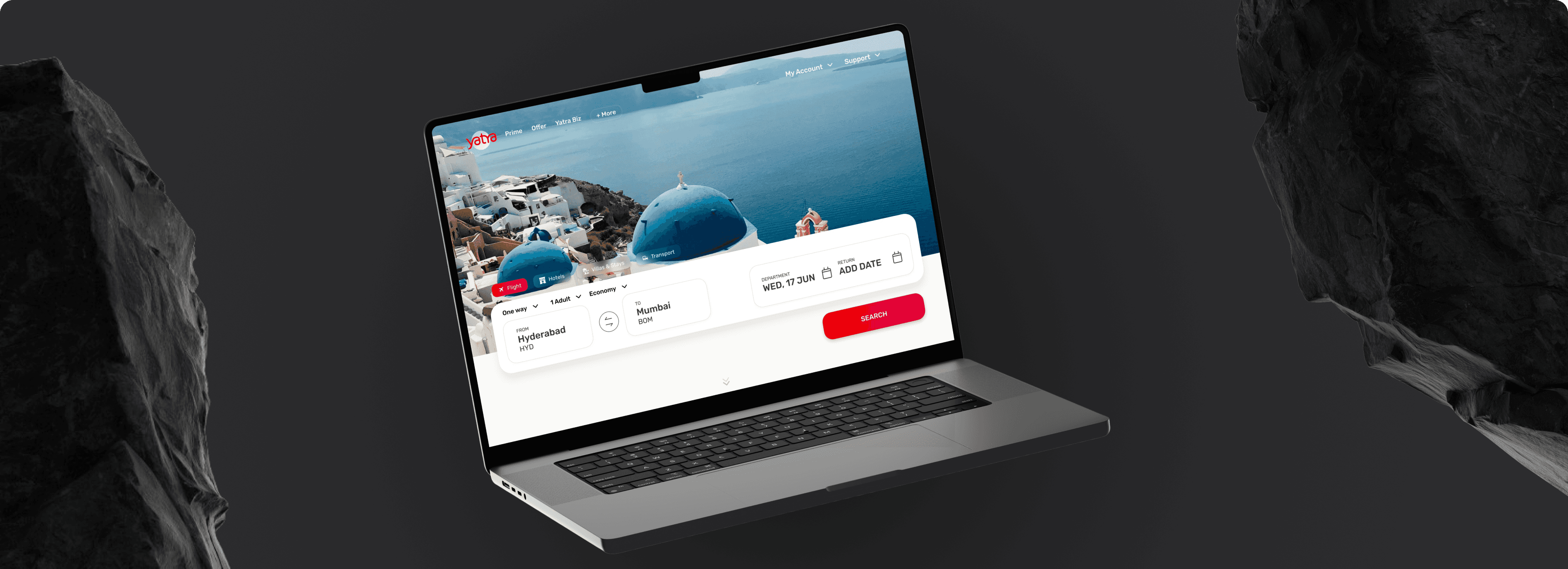
👁️ Overall fresh and modern aesthetic, usage of beautiful background image to prime user for their next trip.
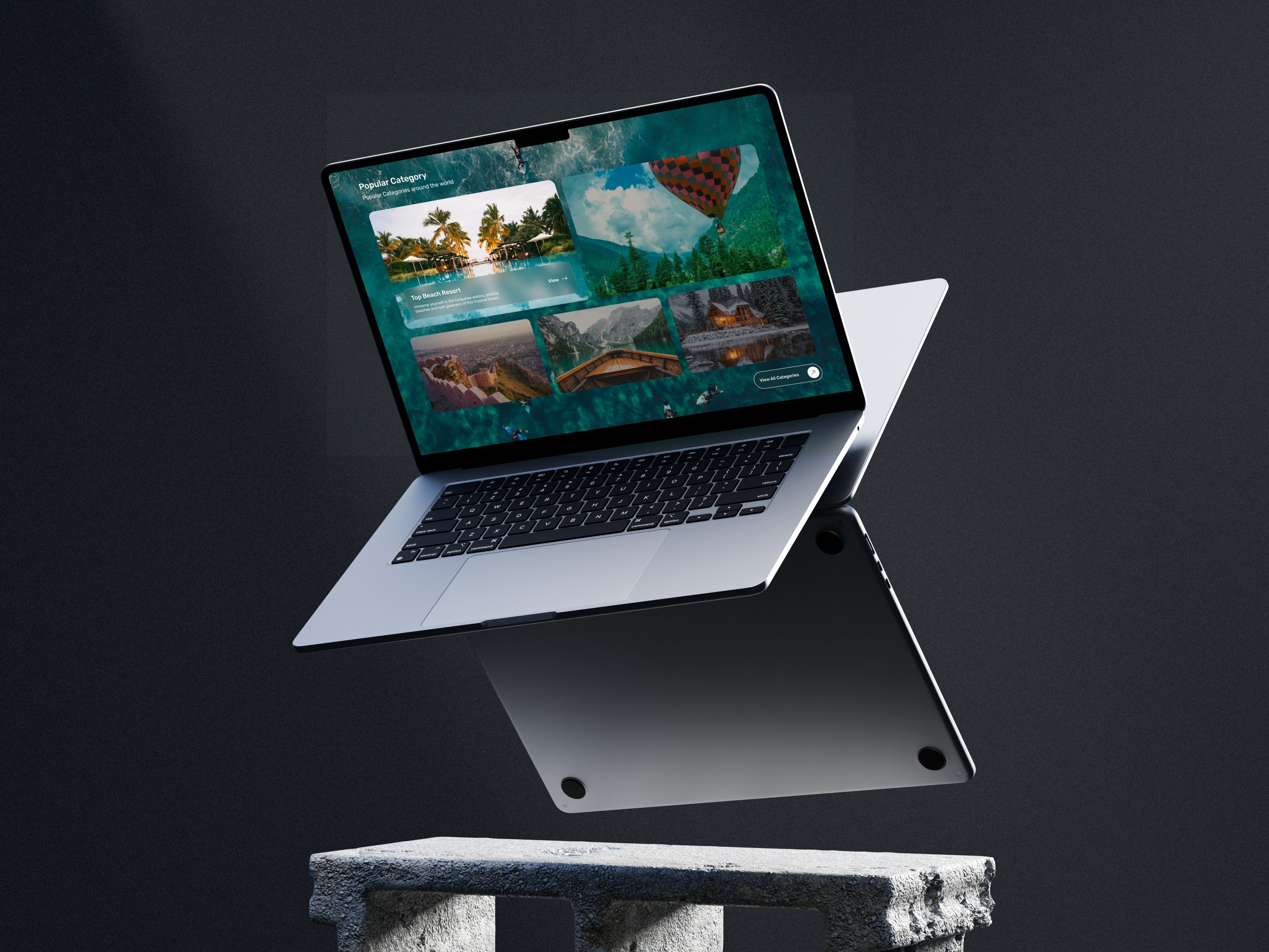
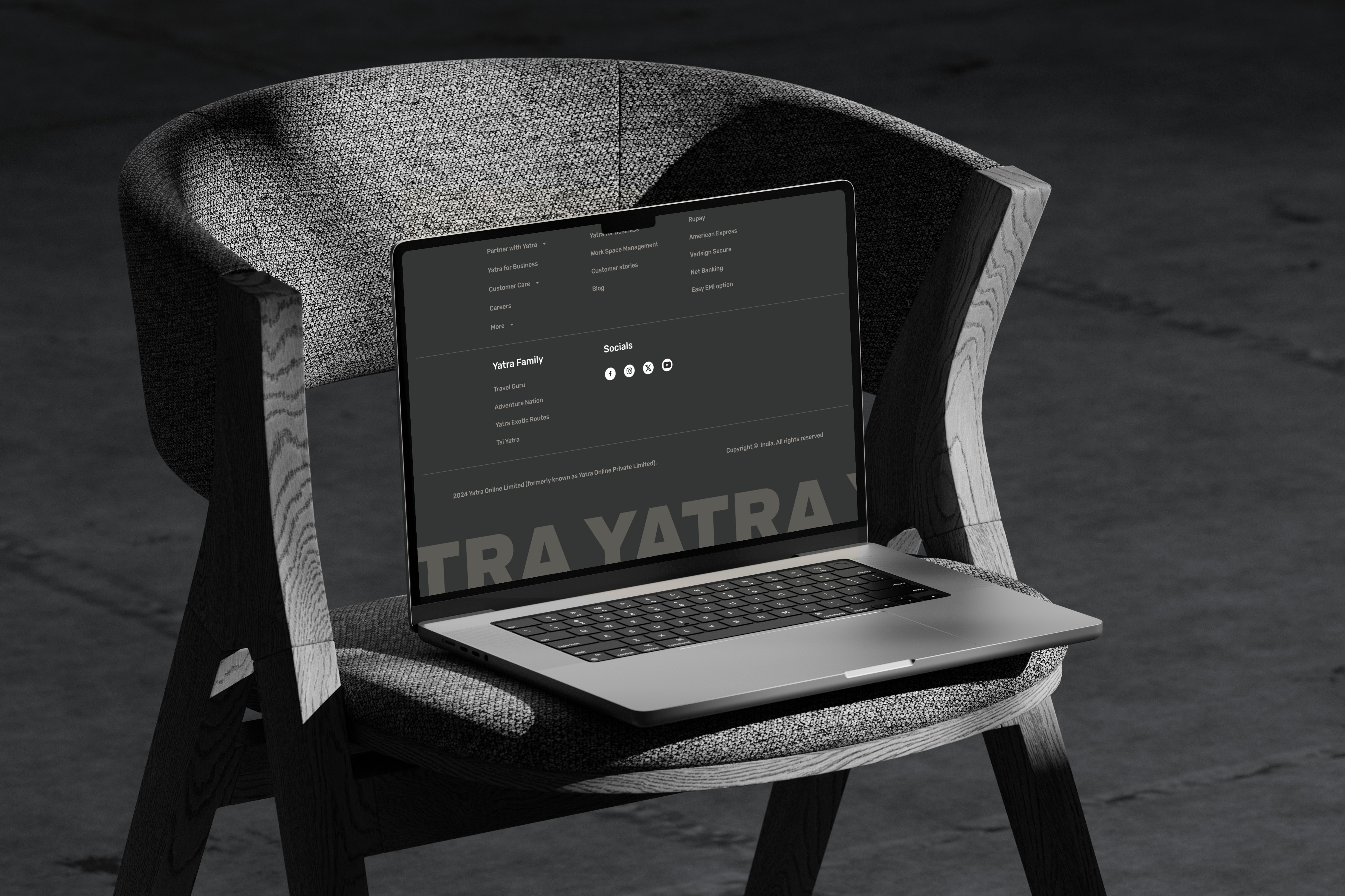
🍱 All the information are segmented making the information easy to digest.
🎯 Now the primary focus of the home page is focused on booking flight👍.
👁️ Overall fresh and modern aesthetic, usage of beautiful background image to prime user for their next trip.
🍱 All the information are segmented making the information easy to digest.
🎯 Now the primary focus of the home page is focused on booking flight👍.
Final Design
Final Design
Booking made easy and engaging
I introduced a step wise booking process, with 4 things in mind:
● Breaking down the booking step in 4 separate steps, using the psychology of progressive disclosure and visibility of system status.
● The layout of the search results follows industry convention with all the filter option on the left and search result on the right.
● Progressive disclosure implemented in the way information is presented in the “view details”.
● And option to sort search result into, best, cheapest and fastest, introduce to give user more control and personalization.
I introduced a step wise booking process, with 4 things in mind
● Breaking down the booking step in 4 separate steps, using the psychology of progressive disclosure and visibility of system status.
● The layout of the search results follows industry convention with all the filter option on the left and search result on the right.
● Progressive disclosure implemented in the way information is presented in the “view details”.
● And option to sort search result into, best, cheapest and fastest, introduce to give user more control and personalization.
Usability testing
Usability testing
Iterative testing in creating successful digital products.
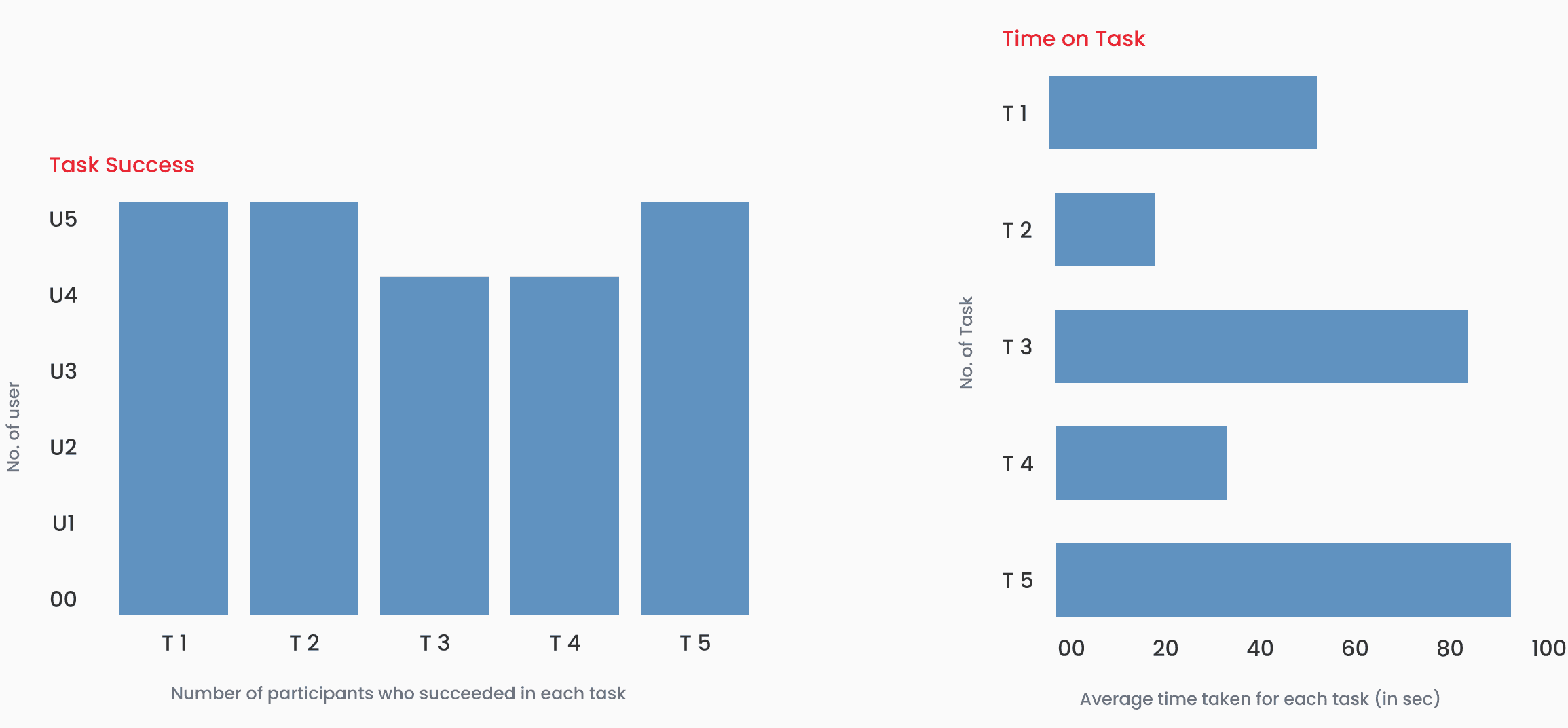
I conducted a usability test and measured the System Usability Scale (SUS) score to get a quantitative and qualitative data of the success of the redesign.
System Usability Scale (SUS) Scores for the above test was 85, indicating excellent usability. This is also a 12.5% increase from the previous SUS that was conducted in the initial phase of user testing.

Qualitative Feedback
Qualitative Feedback
Positive Comments:
"The home page looks great and is very inviting."
"I could easily find the deals I was looking for."
"Booking a flight was smooth and quick."
Negative Comments:
"The red color is too straining on the eyes."
"The price of the travel deals show appear in first glance, so I don’t waste my time clicking on it only to find that it is too expensive."


