DirectKSA
Redesign Business Proposal Section
Role
Role
UI/UX Designer
Time
Time
Duration
2 Weeks
Tool
Tool
Figma/ Figjam
Design Challenge (2/3)
Design Challenge (2/3)
This was one of three design challenges I received from DirectKSA. The task was to redesign the Business Proposal section of the DirectKSA application.
The evaluation criteria were as follows:
● Improve the overall user experience (UX)
● Create a clean, modern, and visually appealing user interface (UI)
● Enhance visual hierarchy and ensure intuitive navigation
● Maintain consistency with the overall app’s design language and style
Problems
Problems
Before Redesign
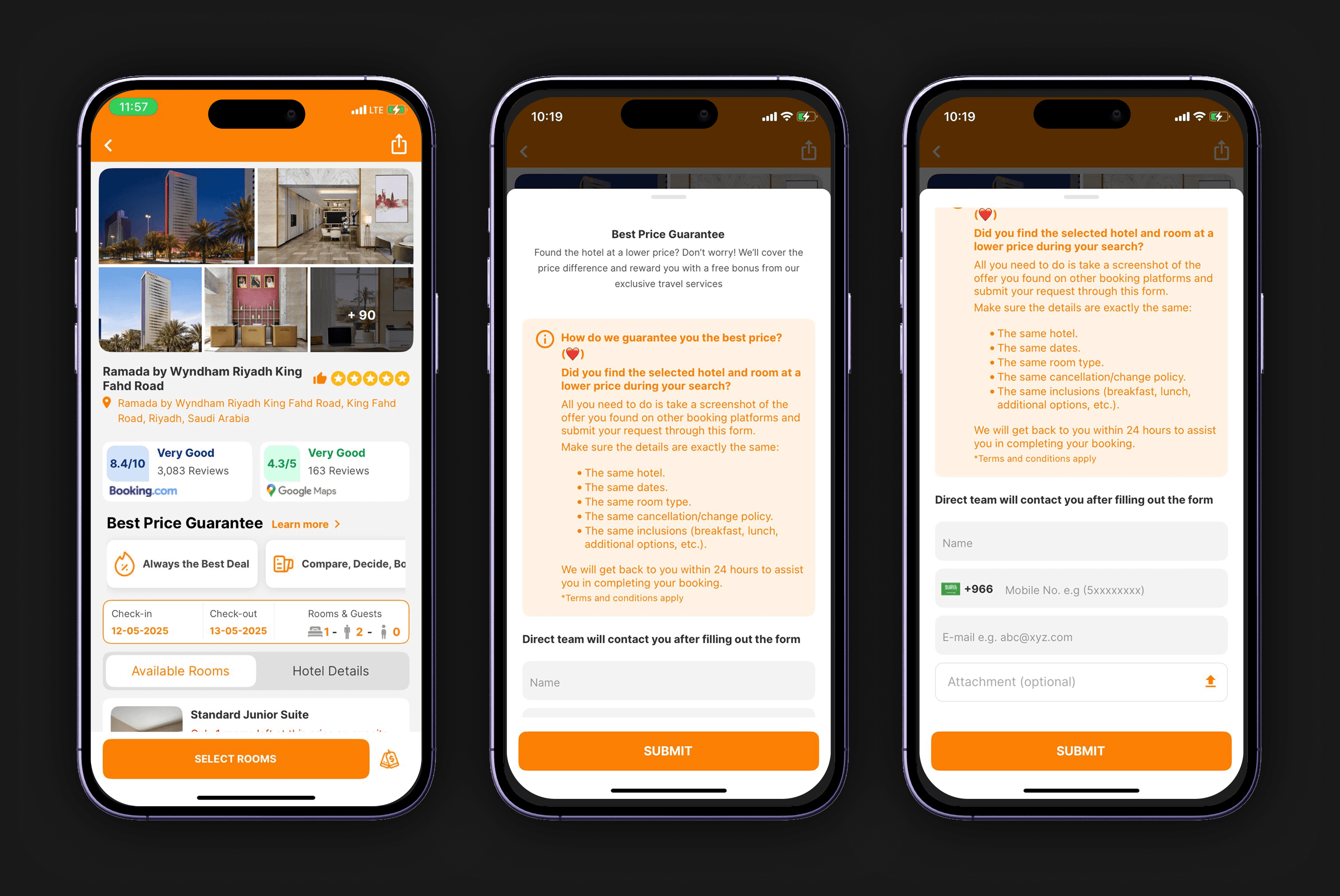
Through a UX audit I discovered some of the UX pain point/ friction:
● Visual hierarchy is cluttered — too many elements competing for attention
● Price isn’t immediately visible (users expect to see rates right under the hotel name or images)
● Images are poor quality
● Too much text in close proximity (hotel name, address, ratings)
● Rating badges look blocky and visually heavy and visual inconsistency in the font text and weight.
● The orange bar at the top feels outdated and wastes vertical space
● Lack of breathing space — feels dense, minimal white space
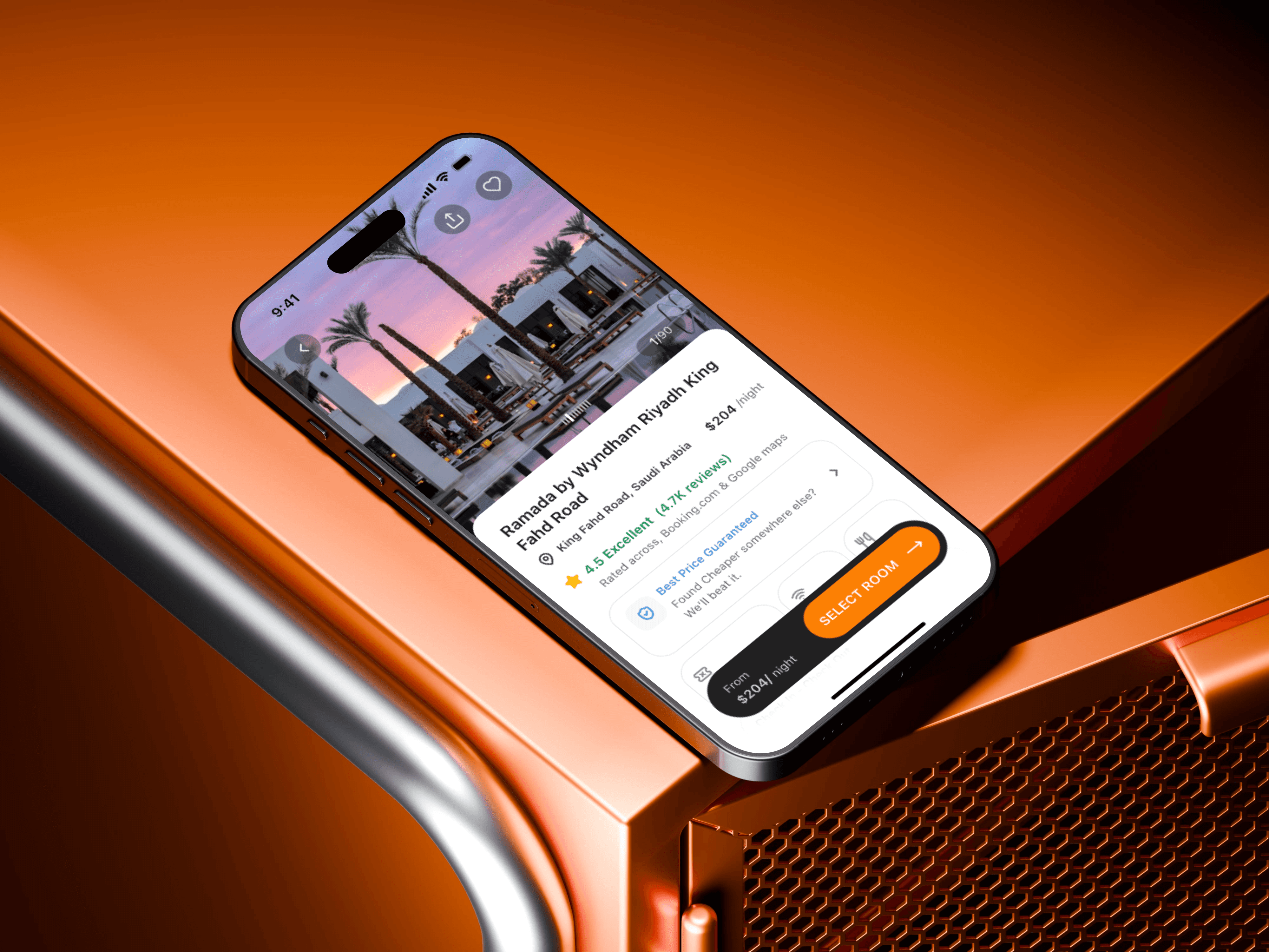
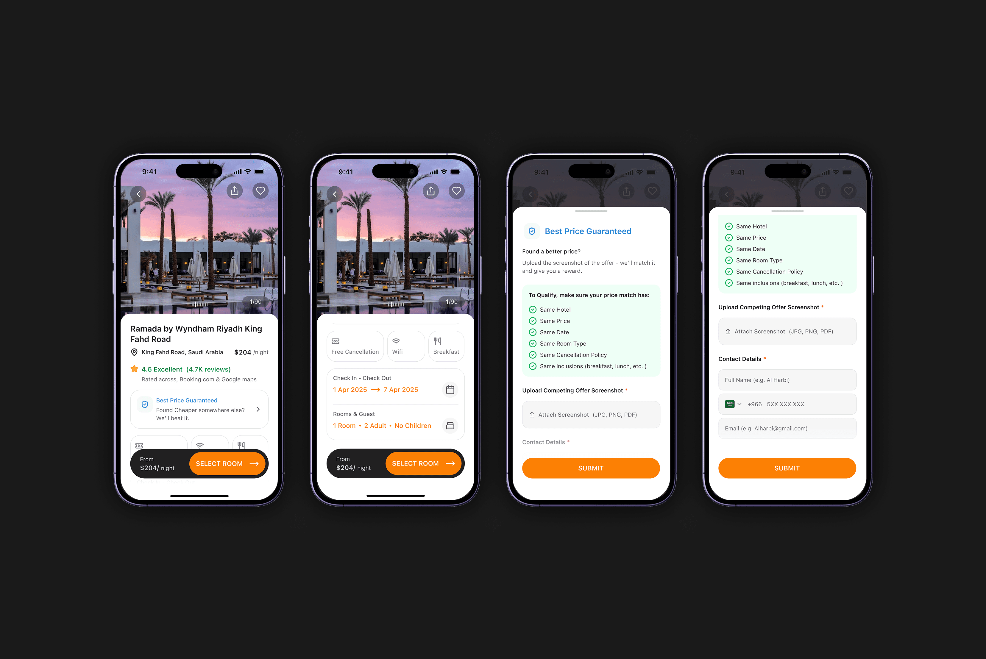
Solution
Solution
After Redesign

✅ Clean Visual Hierarchy & Streamlined Information Architecture
✅ Improve Top Navigation
✅ Optimised Content Structure
✅ Ratings & Promotional Badge Consistency
✅ Amenities, Iconography & Price Placement
✅ Best Price Guaranteed Modal Redesign
✅ Clean Visual Hierarchy & Streamlined Information Architecture
✅ Improve Top Navigation
✅ Optimised Content Structure
✅ Ratings & Promotional Badge Consistency
✅ Amenities, Iconography & Price Placement
✅ Best Price Guaranteed Modal Redesign
Research
Research
Identification of UI/UX issues in the Business Proposal and Best Price Guaranteed sections.
Information Archtecture
Information Archtecture
Evaluated and restructured the Information Architecture (IA) of the content based on UX research data.
Problem: At present, it’s difficult for users to quickly evaluate hotel options and make booking decisions on mobile because of cluttered layouts and inconsistent content hierarchy.
Problem: At present, it’s difficult for users to quickly evaluate hotel options and make booking decisions on mobile because of cluttered layouts and inconsistent content hierarchy.
Goal: The goal of this Information Architecture is to help users easily check a hotel’s desirability, price, and availability, while offering reassurance and making the booking process clear and simple. This reduces mental effort and decision-making difficulty in a competitive travel market.
Goal: The goal of this Information Architecture is to help users easily check a hotel’s desirability, price, and availability, while offering reassurance and making the booking process clear and simple. This reduces mental effort and decision-making difficulty in a competitive travel market.
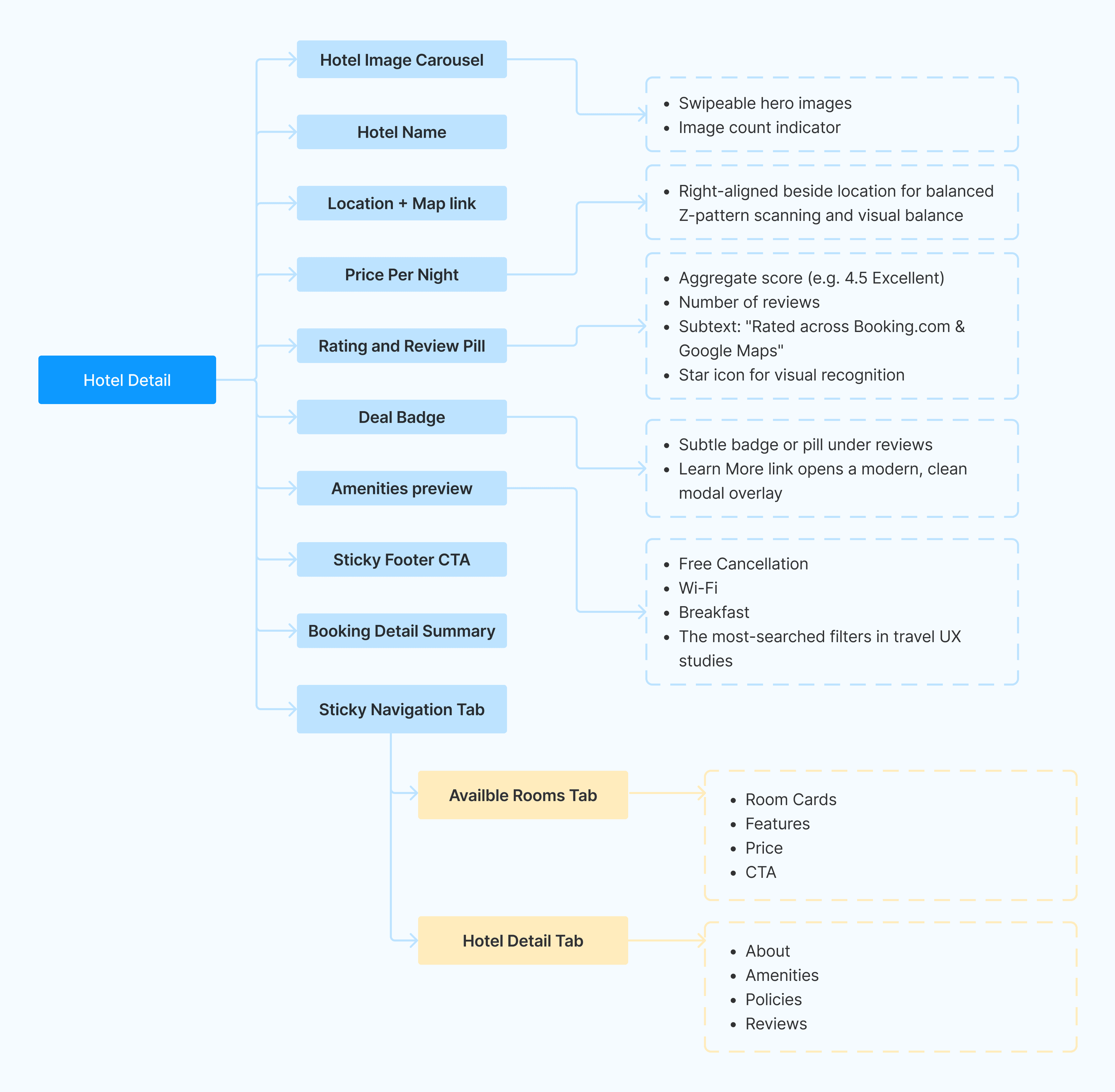
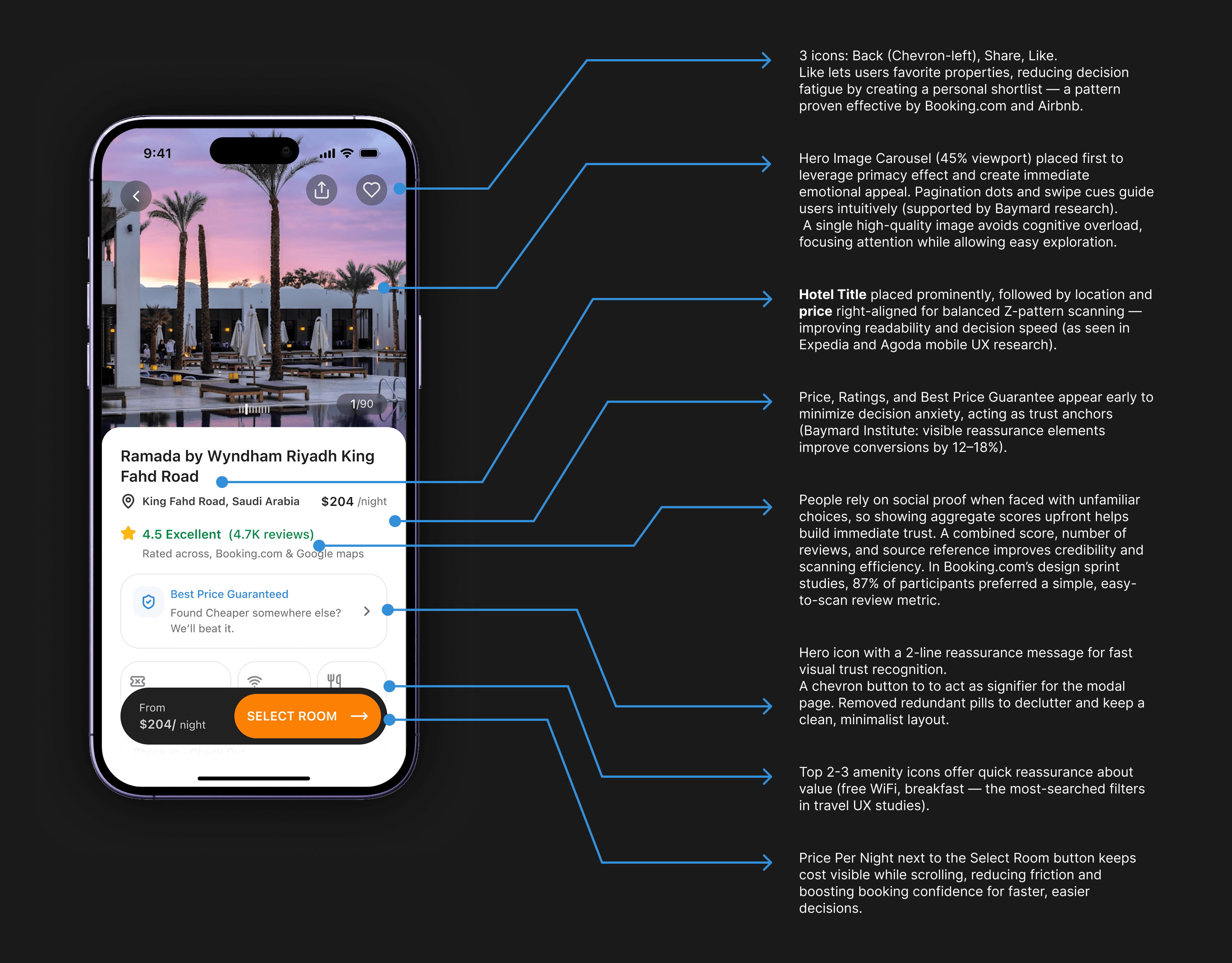
● Hero Image Carousel: Positioned at the top for instant visual appeal, with hotel name, location, and price immediately visible for quick decision-making.
● Ratings & Reviews Pill: Combined rating, review count, and source shown together to build trust at a glance.
● Deal Badge & Amenities: Best Price Guarantee badge and 2–3 key amenity icons offer quick reassurance without clutter.
● Sticky Footer CTA: Persistent ‘Select Room’ button keeps the main action accessible on mobile for better conversions.
● Booking Details Summary: Placed after hotel highlights to match user decision flow, with easy access to edit details.
● Best Price Guarantee Modal: Progressive, action-first modal reduces friction and increases task completion.
● Icon Sizes & Navigation: Optimized icon sizes and spacing improve tap accuracy and maintain a clean, usable interface.Thoughtful spacing and ordering improve tap accuracy and task predictability.

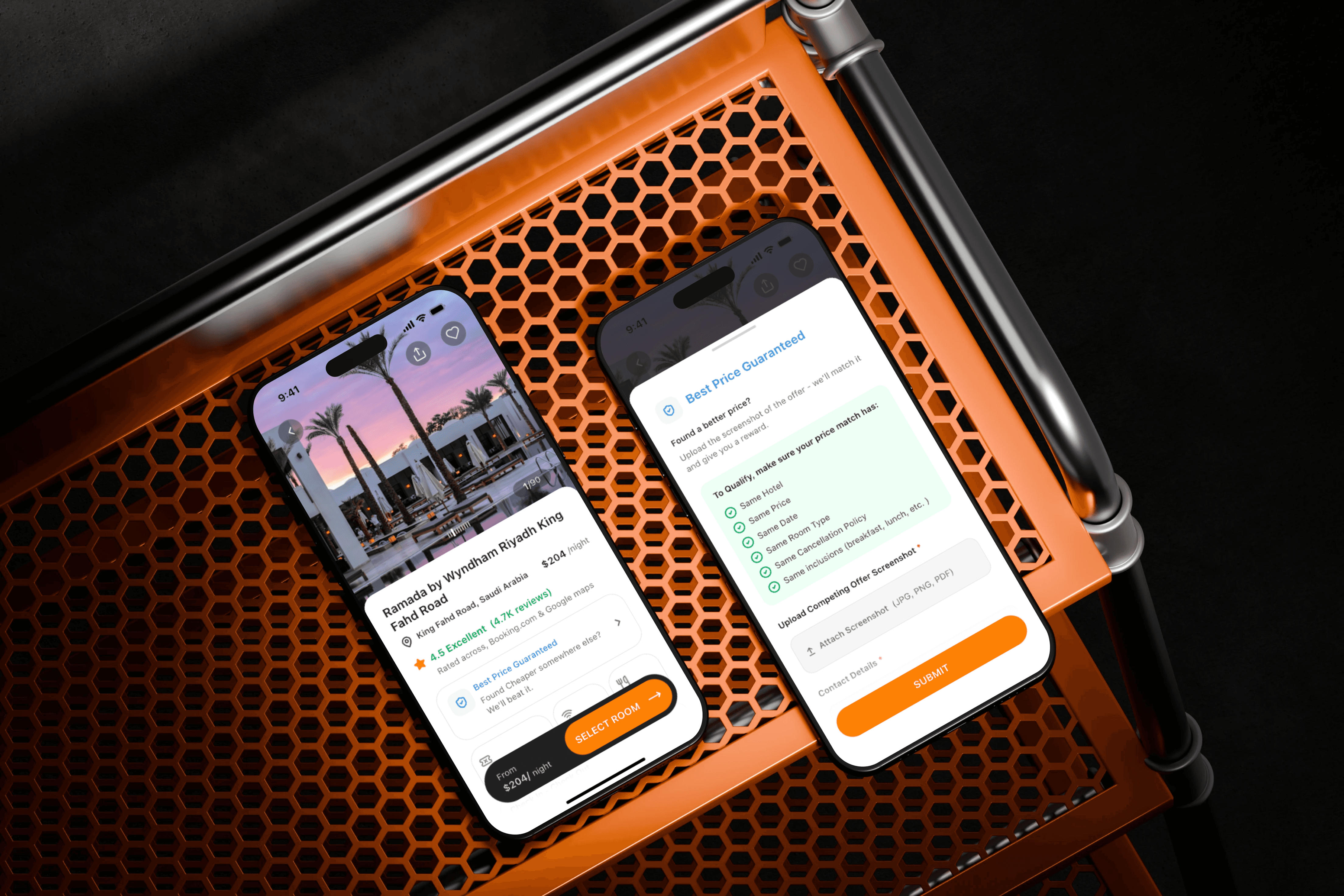
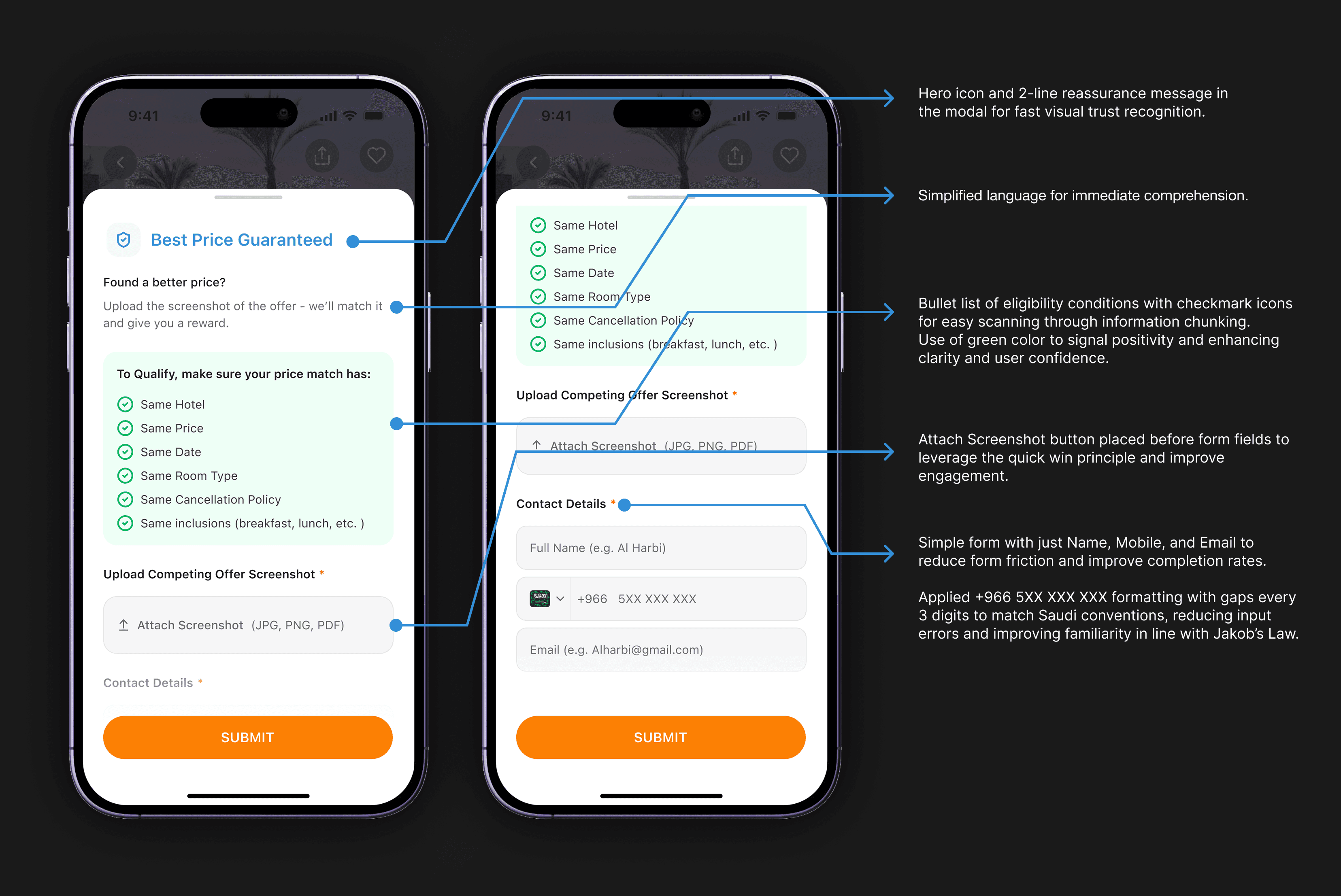
Since this section (Best Price Guaranteed) was unique to DirectKSA, clarity was essential:
● Hero icon and 2-line reassurance message in the modal for fast visual trust recognition.
● Simplified language for immediate comprehension.
● Bullet list of eligibility conditions with checkmark icons for easy scanning through information chunking.
● Attach Screenshot button placed before form fields to leverage the quick win principle and improve engagement.
● Simple form with just Name, Mobile, and Email to reduce form friction and improve completion rates.
● Applied +966 5XX XXX XXX formatting with gaps every 3 digits to match Saudi conventions, reducing input errors and improving familiarity in line with Jakob’s Law.
Wireframe
Wireframe
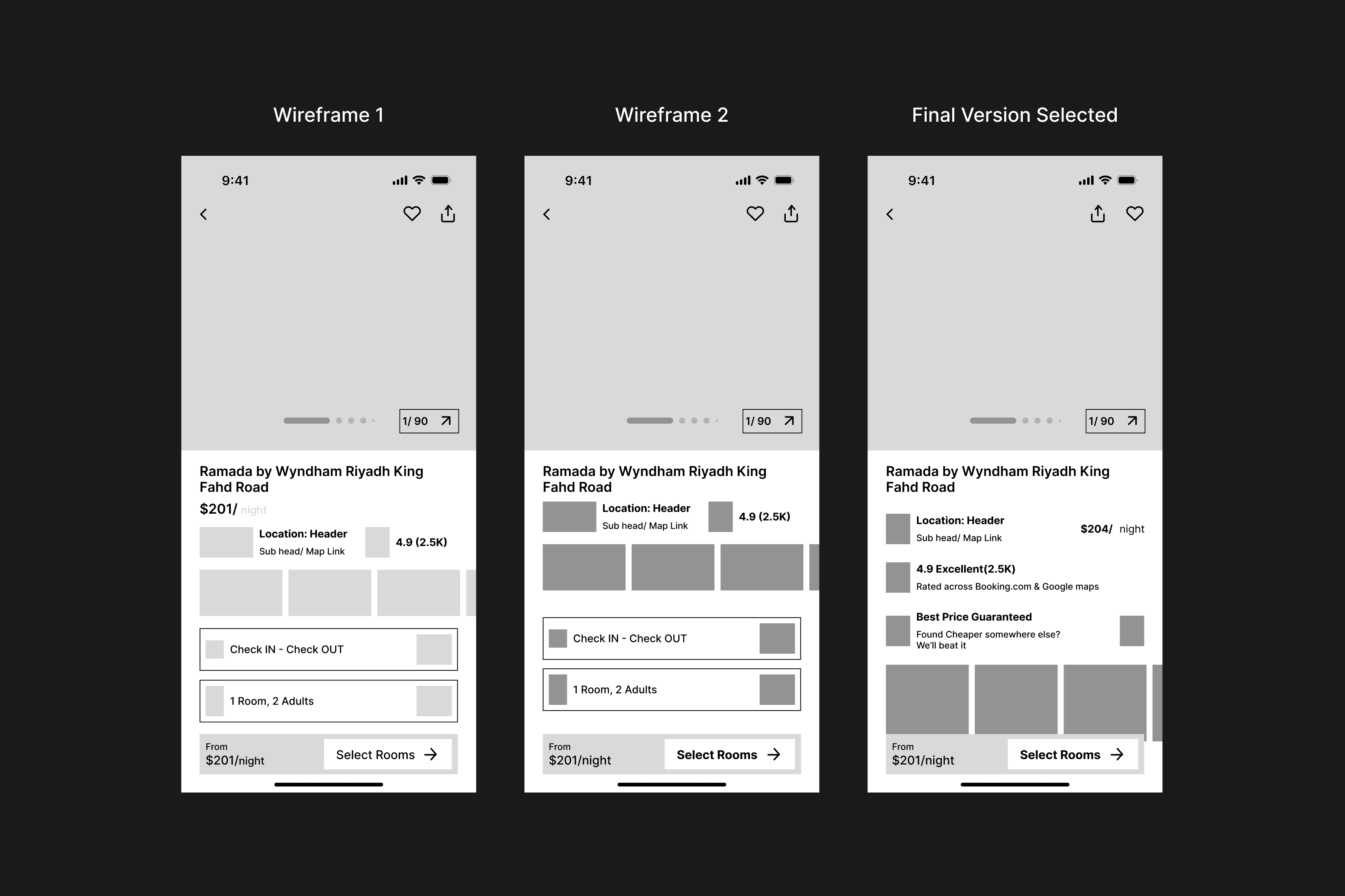
A detailed wireframe was created alongside the Information Architecture to ensure the visual concept aligned with the mobile screen’s grid layout. This wireframe provided a strong foundation and saved time before moving on to visuals and styling.
A detailed wireframe was created alongside the Information Architecture to ensure the visual concept aligned with the mobile screen’s grid layout. This wireframe provided a strong foundation and saved time before moving on to visuals and styling.
Style Guide
Style Guide
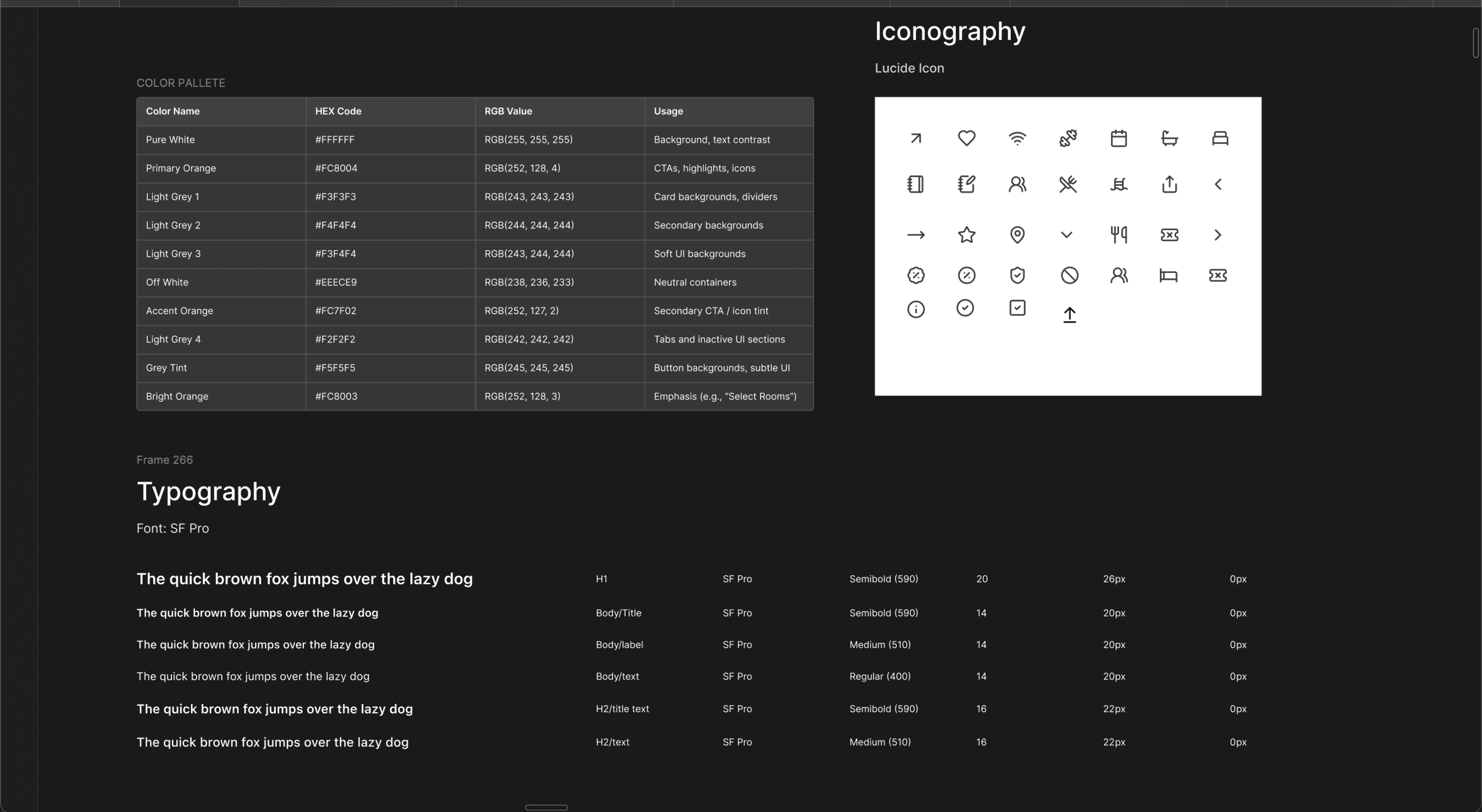
Since the color palette was set, I used brand colors. Without access to the brand’s type and icons, I chose SF Pro for its readability and clean look, and Lucide icons for their simplicity and visual consistency.
Since the color palette was set, I used brand colors. Without access to the brand’s type and icons, I chose SF Pro for its readability and clean look, and Lucide icons for their simplicity and visual consistency.
Hi-fidelity Design Iteration
Hi-fidelity Design Iteration
I went through 3 Design iteration before settling on a final design that not only solved all the initial ux friction points but also looks clean and modern.
I went through 3 Design iteration before settling on a final design that not only solved all the initial ux friction points but also looks clean and modern.

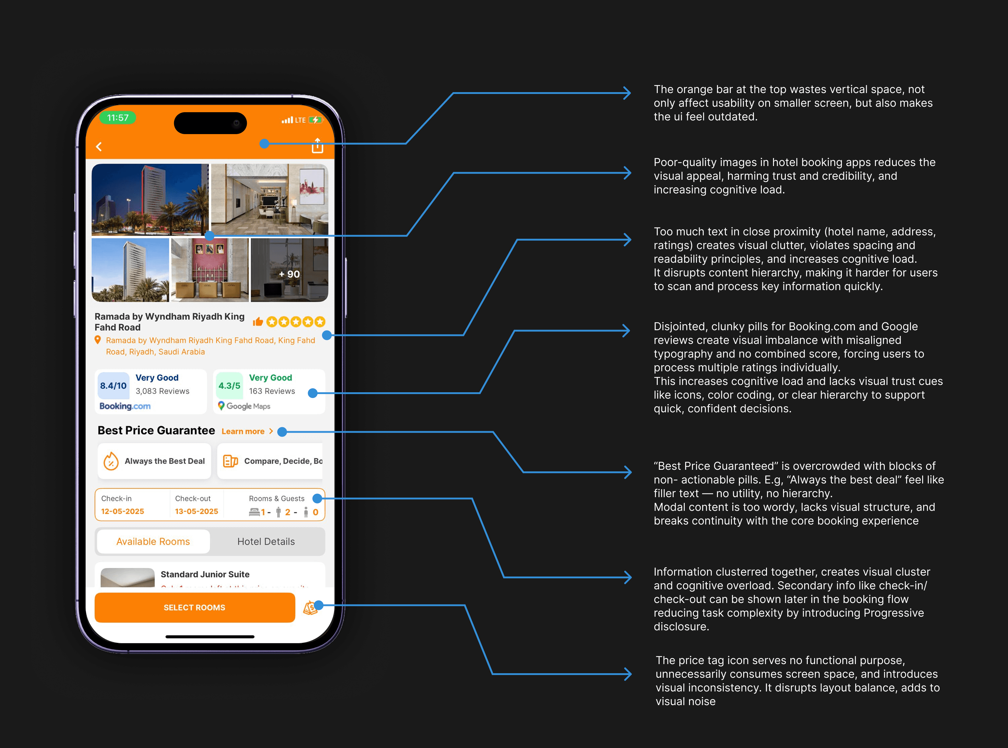
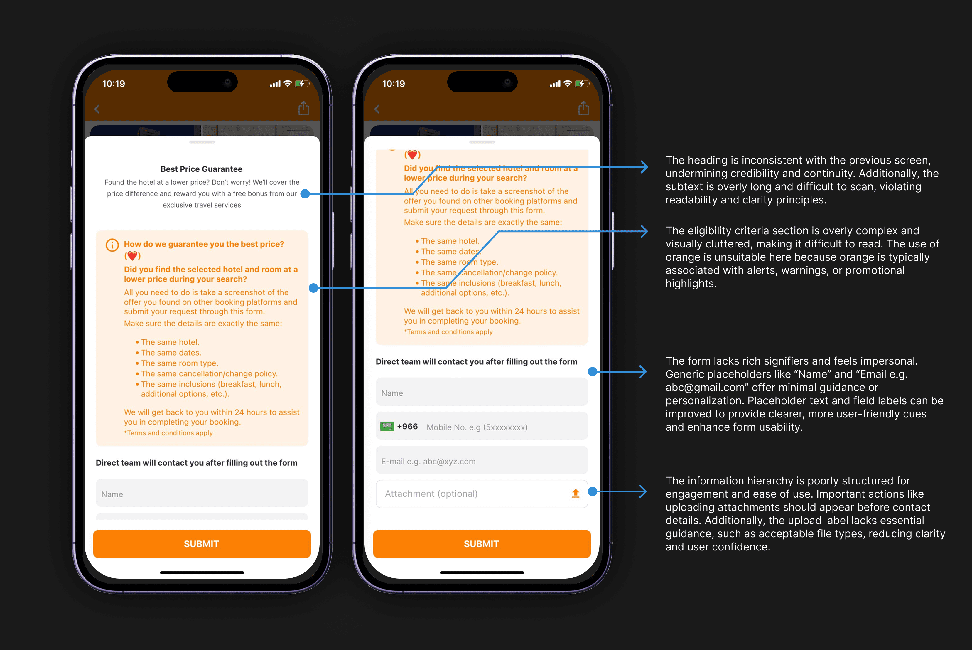
Hi-Fidelity: In-Depth Screen Review
Hi-Fidelity: In-Depth Screen Review
Here's the Design Rationale behind and point to point break down of each elements
Here's the Design Rationale behind and point to point break down of each elements
Conclusion
Conclusion
Thank you for reading this mini case study. It was both fun and challenging—not only during the project but also while deciding what to present. I truly appreciate you taking the time to go through it.
Thank you for reading this mini case study. It was both fun and challenging—not only during the project but also while deciding what to present. I truly appreciate you taking the time to go through it.
Thank you for reading this mini case study. It was both fun and challenging—not only during the project but also while deciding what to present. I truly appreciate you taking the time to go through it.
